How to read and create Pareto Charts
Pareto Principle
We have all heard something about the Pareto Principle. Actually it goes with different names, such as:
- Pareto Low
- 80-20 Rule
- The Principle of Imbalance
- All kind of modifications of these
It is very powerful tool, which can help us perform a root cause analysis and detect the most important issues in our project.
The most common phrase related to Pareto principle is:

You can encounter the following as well:
- 80% of the results come from 20% of the efforts
- 80% of the sales come from 20% of the customers
- 80% of the work is completed by 20% of the team
- 80% of the customers uses only 20% of the features
In this article we will have an overview of the Pareto Diagrams, how to read them and how to create them.
First let’s take a look at the following scenario.
The problem
Our management is giving us a task to improve the user experience in the company’s website. So what should we do first?
One option is to collect feedback from the current users for what is bothering them.
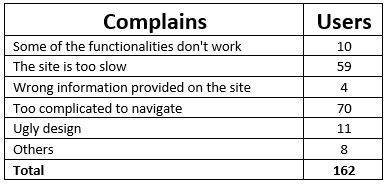
The result of online survey, sent to 200 of our regular visitors, is a total of 162 responses.
What should we do next?
Create a list
Divide the responses to different categories (it is considered a good practice to have less than 10 different categories).
At the end we come up with the following list, which now should be analyzed.
That’s the moment when the Pareto Diagram comes to our mind.
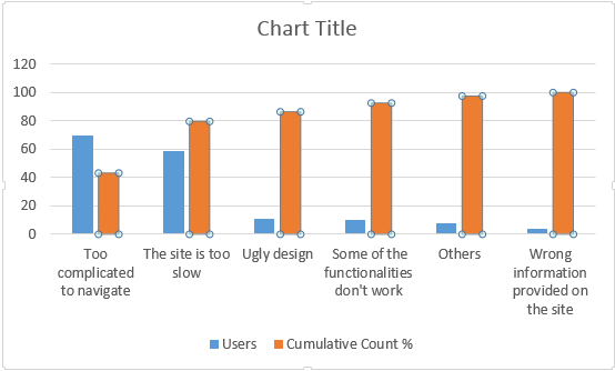
Take a look at the graphic below, it looks complicated, but actually it is not at all.
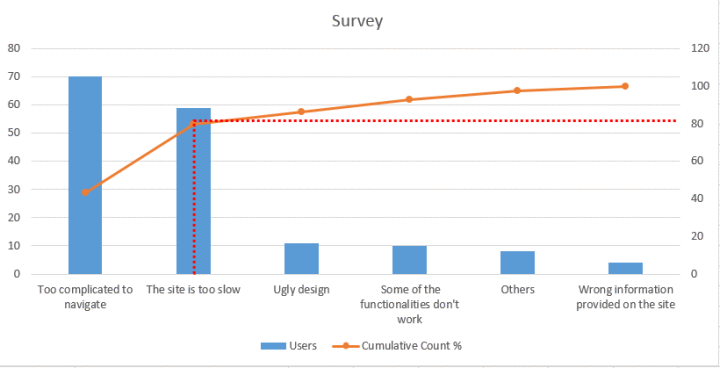
As you can notice the blue bars represent the number of users complaining about similar issues. The interesting part here is the orange line which is also called cumulative line or Pareto curve.
This line gives us the cumulative weight of every bar.
So far, so good. But where exactly lies the Pareto principle here?
Imagine you can draw a line across from the 80% mark to the cumulative line and then down into the bars, as in the diagram above (the dotted red lines).
This means that 80 percent of our complains come from the first 2 issues – the site is too complicated to navigate and it is too slow.
This sounds awesome, right? If we manage to eliminate the two problems we will get significantly higher feedback.
Create your own Pareto Chart
Now when you already bought the idea of using Pareto Diagrams, let’s learn how to create them.
Step 1
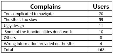
We need to get our initial statistics and sort them out from largest to smallest:
Step 2
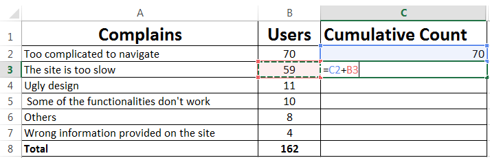
We need to create another column for the cumulative values. For each cell in the Cumulative Count row as value we need to set the total number of complains from the rows above.
So for instance, in the cell C2 we put the same value as the one in B2, as this is the first row we count.
Step 3
After that in every cell we put the sum of the users’ complains (the current row included).
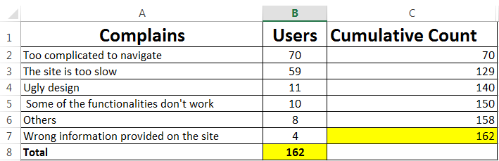
As you can see in the last 7th row we have the same value as the total number of complains. This means that our calculations are correct, so we can proceed with getting the cumulative percentage.
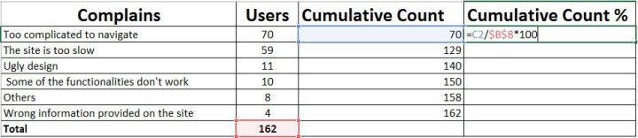
Step 4
The next thing is to create a Cumulative Count % Column which can count the percent of every row from the totals. You can do this by dividing the cumulative value by the total and multiply by 100:
After we do that for the whole table it is time to create the graphic.
Step 5
First you need to select Column A, B and D at the same time without selecting the Total row.
Then click on Insert tab of the Excel and select a graphic.
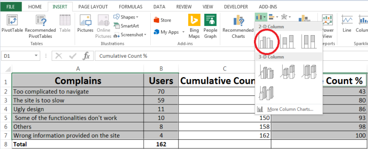
Right after you do this, you will receive the following diagram, which of course needs to be modified a bit.
Step 6
You have to select the orange bars and click right button of the mouse, then select Change series char type.
You will get the following screen from where you need to pick the Combo type and select the second chart.

That was the last step before our creation is done.
I hope the article was useful to you.
If you like this, follow me on twitter!